Capstone Progress Log
“I See You” — Capstone Project Development
Welcome to the behind-the-scenes journal for my graduate Capstone project, I See You; a brand experience honoring the layered identity of Black veterans.
This page serves as my progress platform, a living sketchbook of my ideas, design experiments, research insights, and development process throughout the semester.
You’ll find project updates, revised strategy, visual development, and reflection notes as the work evolves.
wEEK 1
June 2
I came into this project with a lot of weight on me—personally, culturally, creatively. I knew I wanted to build something that mattered, something that pulled from my lived experience as a Black veteran. At first, the project was centered on trust in design: how it’s felt, not just earned. That idea cracked something open for me. I began thinking not just about how trust is communicated, but who it’s communicated to and who’s still waiting to feel it.
June 6
After a few exploratory conversations and assignments, I started narrowing in on my audience: Black male veterans. That’s where I’ve felt the most tension and the most invisibility in the spaces where identity and service collide. I wrote my first draft concept under the name I See You. It felt right at the time: personal, honest. But I could already feel it shifting.


week 2
June 10
It became clear that this project shouldn’t just be about me. The stories I want to center aren’t mine alone. I decided to reframe the project as We See You—a platform that holds space for a range of Black veterans, across gender and generation. I launched an early survey and began collecting responses. Some came in quickly. The words were powerful. Quiet truths. Unspoken frustrations. I started to understand this project not as a message, but as a mirror.
June 13
I’ve been developing the visual language—colors, type, mood. I chose deep indigo for depth, muted gold for quiet recognition, and warm clay for cultural grounding. These colors, paired with modern and approachable typography, gave the brand a quiet strength. I worked through several tagline concepts, but the ones that stuck came from real words people shared: “Black by birth. Veteran by choice.” “Never folded. Never faded.”
sURVEY FOR bLack Veterans
(For Reference Only - DO NOT FILL OUT, INVITE ONLY)
eARLY EXPLORATION FOR VISUAL IDENTITY


week 3
June 18
This week I started pulling insights from the survey responses and also got some direct feedback from two Black veterans I know. One is a guy I served with in the Army, and the other is a Navy vet I met through my gym. We talked over FaceTime and had a really open conversation about the project, what I’m building, and how it lands with people who’ve actually lived these experiences.
I shared the updated branding, including the new logo with the hand-heart in the shield, some early visuals for the care package, and rough ideas for how the Veterans Day event might flow. I asked them if the visuals felt like they represented them, if the care package would feel meaningful, and if the tone of the event made sense.
Both of them were into the direction. They said the logo felt more personal and thoughtful than the earlier version. One of them said, “It looks like someone actually thought about us,” which honestly hit me. They liked the care package idea too and suggested adding a QR code or something that connects to stories or music from other vets. That felt like a good move…something that adds emotion without needing a bunch of explanation.
They also called out that Veterans Day usually feels pretty surface-level, but this felt different. Something they’d actually want to attend. That gave me even more confidence that this project is on the right track.
I’m going to tighten up the logo a bit so it reads better at smaller sizes, and I’ll explore how to incorporate a digital media component into the care kit. This check-in reminded me why I’m doing this.
June 21
Today I launched the first version of the We See You website. Built it using Figma, keeping it clean and narrative-focused. The homepage prioritizes the Veterans Day event and care package launch with short CTAs and space for updates. It’s not flashy. That’s intentional. It needs to feel like a calm place to land.
We see you landing page
week 4
June 24
Thinking of producing the first event for We See You, I would like it to take place on Veterans Day, November 11, 2025, hosted at B Suite, a Black woman-owned venue in Minneapolis. The alignment between their mission and this project feels natural. Charizma created their brand identity, so there’s already trust and flow. We’ll design the event experience to feel communal, healing, and intentionally unpolished.
June 28
I began sketching out the care package. Every item has to mean something. Nothing should feel like filler. I’m working with: a journal, affirmation cards, a small art print, a branded patch, herbal tea, and something tactile like a candle or fabric piece. I want the box to feel like recognition without having to say much. A design that affirms identity just by existing.
Care Package Inserts
1. Custom Journal
A clean, thoughtfully designed notebook with a prompt insert for reflection and storytelling.
Why: Encourages personal narrative, mental clarity, and legacy preservation.
2. Signature Candle or Incense Cone Set
Scented with warm, grounding notes like cedarwood, sandalwood, or vetiver.
Why: Supports emotional regulation and calming rituals in daily life.
3. Satin-Lined Beanie or Branded Cap
Functional and culturally relevant headwear with a small We See You embroidery.
Why: Combines care and identity—practical, stylish, and affirming.
4. Affirmation or Wisdom Cards (Set of 5)
Featuring short, handwritten-style affirmations or quotes from Black veterans, poets, or community leaders.
Why: Daily reminders of identity, resilience, and dignity.
5. Herbal Tea Pack or Wellness Snack
A caffeine-free blend (like hibiscus or chamomile) from a Black-owned tea brand.
Why: Encourages slow rituals and physical restoration.
6. Embroidered Patch
Brand mark embroidered to resemble patches worn on duty
Why: A small badge of honor—worn, stitched, or kept as a token.


week 5
July 3
I’ve been thinking a lot about the difference between appreciation and understanding. So many veterans’ events stop at “thank you.” This one won’t. The event programming will include story circles, quiet space, care kit pickup, and an audio installation with quotes from survey respondents. We’re building something slow and respectful. Not a celebration. A gathering.
July 9
I circled back to the research and finalized my insight slides. The quotes are still hitting me. One person said, “It’s like you’re fighting two wars. One for the country, and one to be seen by it.” That single line affirms this entire platform. Design should hold that tension. The work ahead is not about decoration. It’s about honoring what’s already true.
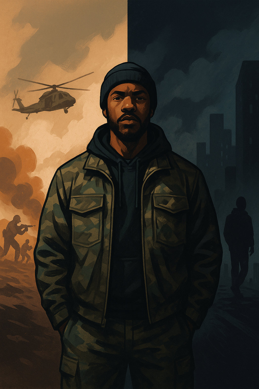
Disclaimer: This image was created using AI to visually represent a concept and communicate the emotional message behind the project. It is not a photograph or real person, but a symbolic illustration.
week 6
July 13
I’ve started assembling the final deck and summary materials. At this point, I have: a brand system, survey-backed insights, a care package concept, a live website, and a confirmed event with programming. The story is tight. The direction is clear. Now it’s about telling it well.
July 17
This is the close of the Capstone phase, but the beginning of We See You. The work has shifted me. I’ve learned that design at its best isn’t about solving. It’s about seeing. Listening. Reflecting. This project showed me how to build a creative space where visibility isn’t just a gesture. It’s a promise.